Documentation
Designer
since 1.1.0
Spektar VSTGUI designer allows creating VSTGUI definitions for VST Plugins. The designer can be opened from the main window, by clicking Designer button below the main Schematic pane.
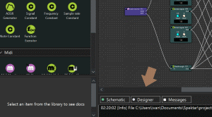
You can switch back to schematic by clicking the Schematic button.
Using the designer
Designer window is split in three areas
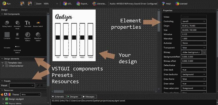
- Left sidebar that contains the VSTGUI visual element palette, Design structure, Presets and resources
- Central design area - drag and drop from the palette to the design to add components
- Properties sidebar - where you can edit properties for individual components
The designer should be intuitive to use so we won’t cover every details. Following sections describe some key functions, behaviours, limitations and use cases.
Run mode
When the design is running, designer turns into a controller. You won’t be able to edit the design, but the utility of being able to control your design in real time from the VSTGUI beats the need to edit VSTGUI while design is running.
Presets
Presets are presently supported only within Spektar. They are not bundled with the plugin source on export and exported source won’t be able to parse them. This is an important feature high on the todo list, but it’s not there yet.
Themes
Spektar ships with two themes which can be found in user-documents-home/Spektar/themes. Themes essentially offer a visual style for supported VSTGUI components, along with associated resources.
Creating a new theme is reasonably straightforward -
- Create copy of one the bundled theme directories
- Rename the copied directory - e.g. mytheme
- Rename the the two configuration files so they match your theme name - e.g. mytheme.p and mytheme.theme)
You now have a new theme. Examine the the config files and note that - ideally you should leave config files unchanged and only change graphics. This will ensure that switching between themes at design time doesn’t mess up your design.
Theme styles
Each theme can have several styles for a component. Take for example a Slider.

We may want different highlight colours on the slider handle, or have graded background. Similarly with knobs, we may have a need for different sizes, highlight colors or types - balance knob for example may need a different grading.
Resources
Generally you won’t need to review / edit content in this panel. You can add fonts, bitmaps etc by selecting them in the properties pane on the fly and they will be added automatically.
Property editor
Property editor shows all defined properties for the selected VSTGUI element.
Spektar only supports relatively small subset of all defined properties - main focus is on simplicity of editing rather than on supporting and emulating all VSTGUI weirdness. It’s always advisable to thoroughly test your plugin after export and build.
For the moment, property editor can’t edit multiple elements at the same time. This is an important feature high on our todo list for implementation.
Fonts
VST can be built for multiple platforms so having consistent fonts is not always easy. The only way to guarantee consistent rendering is either using bitmaps (e.g. a CViewContainer background where text is already rendered) or by supplying true-type fonts. VSTGUI supports TTF fonts so this is the way to go.
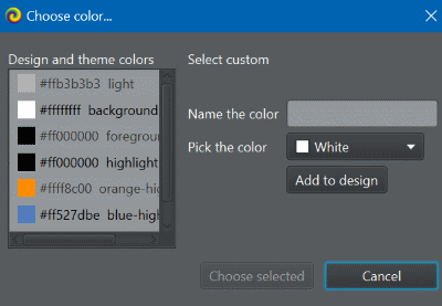
VSTGUI treats each font (along with it’s size and style) as a resource. So essentially a font is (face, size, style, weight). Choosing a font from already added fonts is done via Properties pane. Select a Text visual element and find the Font property:

To manage fonts and add new TTF based fonts, click on ... and the font chooser will be shown as below.
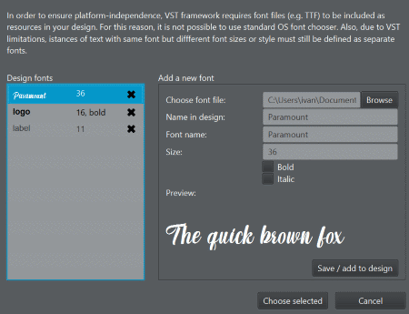
To add a font, browse for the TTF file, set parameters (name in design, size and style) and click on “Save/add to design”.
To remove a font, click on the x next to it on the left-hand side “Design fonts” list.
Once you have added / removed fonts, choose the font from the left-hand-side and click “Choose selected”.
Bitmaps
Similar to fonts, in VSTGUI bitmaps must be declared before they can be used. Spektar hides this by allowing you either select existing bitmap from a dropdown (e.g. editing background property in the properties pane) or simply browse for a file (which, behind the curtains, adds the bitmap to the design).
Managing inputs, outputs and control tags
Spektar 1.1.0 and later includes a new I/O configuration dialog that can be particularly useful for VST plugin definition.
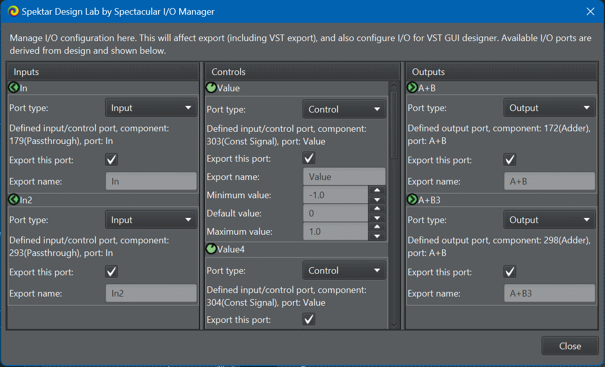
Controls and control-tag
In VSTGUI, each visual control is bound to a control-tag. The control-tag binding essentially binds the visual control to a design element - typically a control port. In designer, you can bind a UI control to a control tag by either right-click / context menu, or by editing in the properties pane. Spektar automatically offers defined controls to be used as control tags.
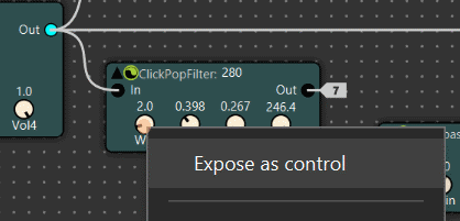
You can define a control as a control-tag in a number of ways. The easiest is to right-click on any pot in the schematic view and select “Expose as control”. Once a control is exposed, it becomes available to use as a control-tag in Designer.
It is quite common that we need to customise exposed controls. Say for example we want to assign a different name to it, or set a different range (min/max allowed). This can be done using the I/O panel.
Special cases
Control tags are inherently modifiable - (e.g. gain control in a VST plugin can be controlled by the VST host / your DAW). However, VSTGUI uses control-tags for values that are read-only too - e.g. in the case of CVuMeter.
To use the VSTGUI VU meter, add the Spektar VU component in your schematic. This will define this special kind of control-tag that can be then bound to the VSTGUI VU component.
Inputs and Outputs
The rules for defining input and output ports for VST export are described in vst effect and vst instrument documentation.
Where is the design saved?
The design file is saved in a des file - e.g. if your project is called project.dgml, the designer savefile will be project.dgml.des. The des file holds design time contents and is used during VST export to generate all necessary elements needed to create the VST gui - namely, the VSTGUI xml definition and resources.
 Spektar Design Lab